Moves For Less
01 — The Problem
Moves for Less was trying to reach budget-conscious customers, but their messaging felt too formal. The tone didn’t match their audience. It sounded polished and professional, not personal or relatable. As a result, the message wasn’t sticking.
02 — The Solution
My brilliant designer colleague came up with a super clever idea: a mailer that shipped flat but popped into the shape of a house when opened. I paired that eye-catching format with simple, straight-talking copy that got to the heart of it. Moving is stressful, annoying, and expensive. Moves for Less makes it easier, more affordable, and way less painful. We just had to say that ... plain and clear.
03 — The Result
Once the mailers went out, Moves for Less saw a 200 percent increase in bookings. The tone struck such a chord that they decided to rebrand their entire presence around it. Same great service, now with a voice that actually sounds like them.
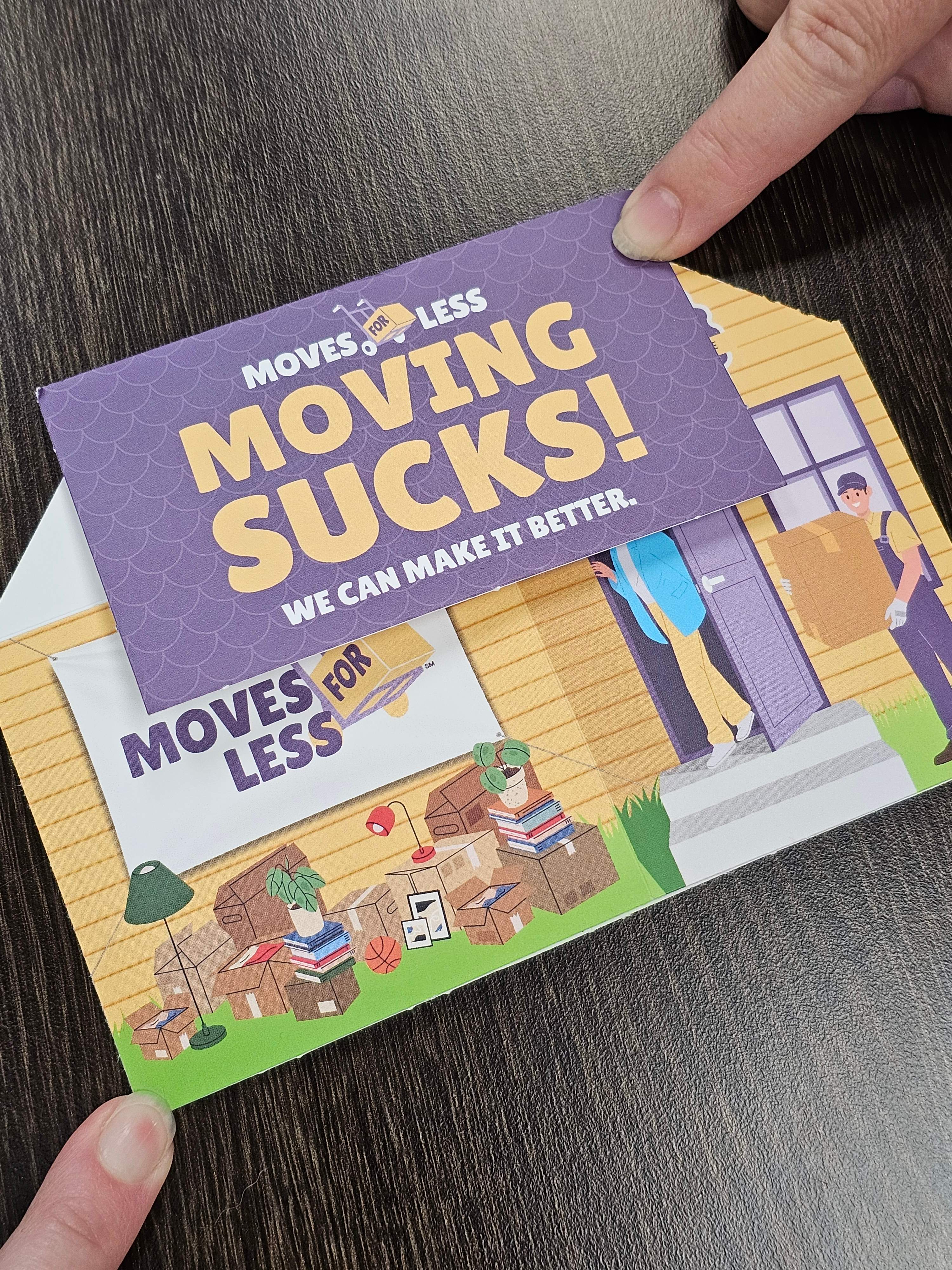
Easy to mail in a cost-effective, flat envelope.
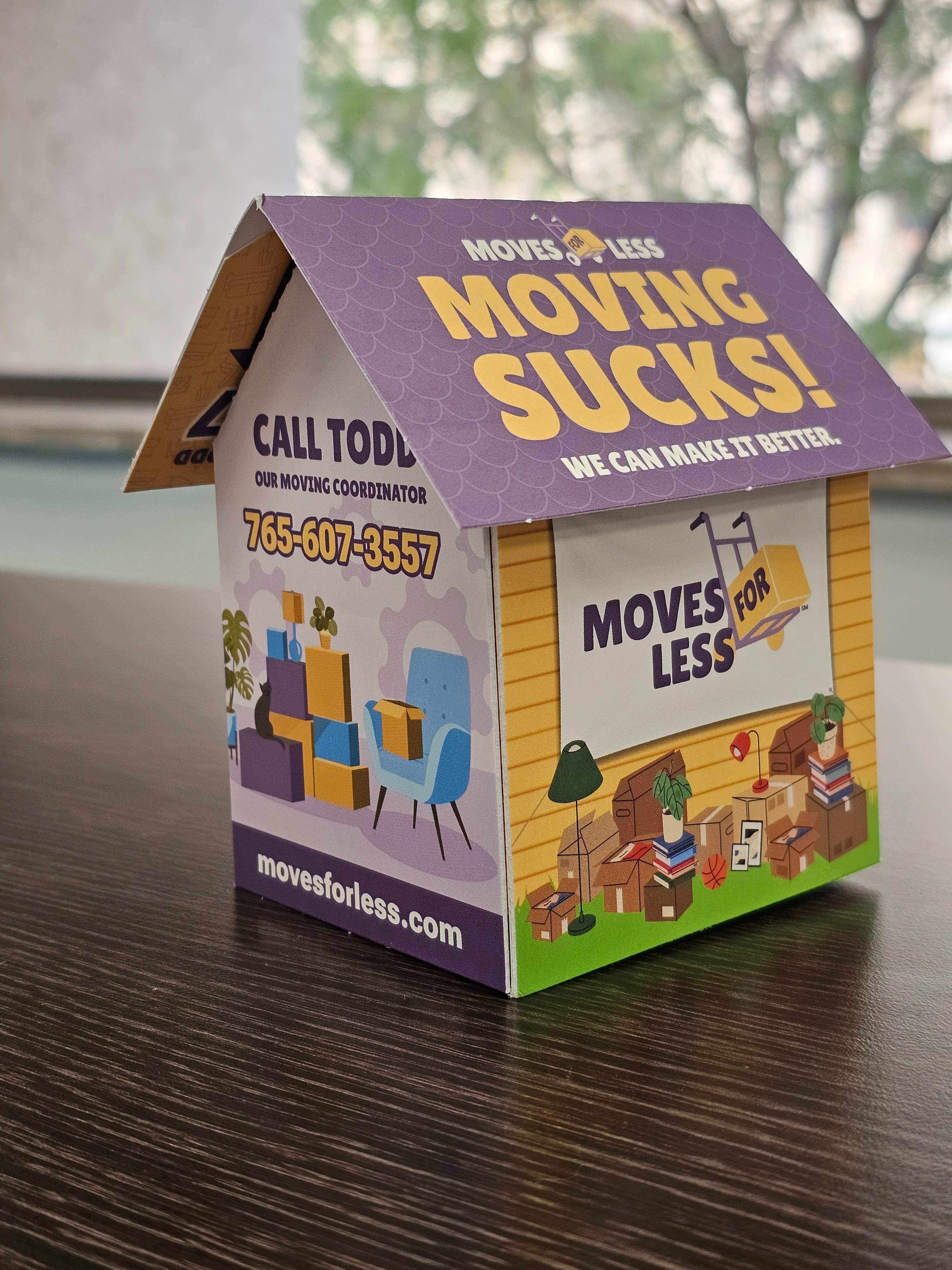
Then ... BAM! The whole thing pops open to reveal a really smart design.
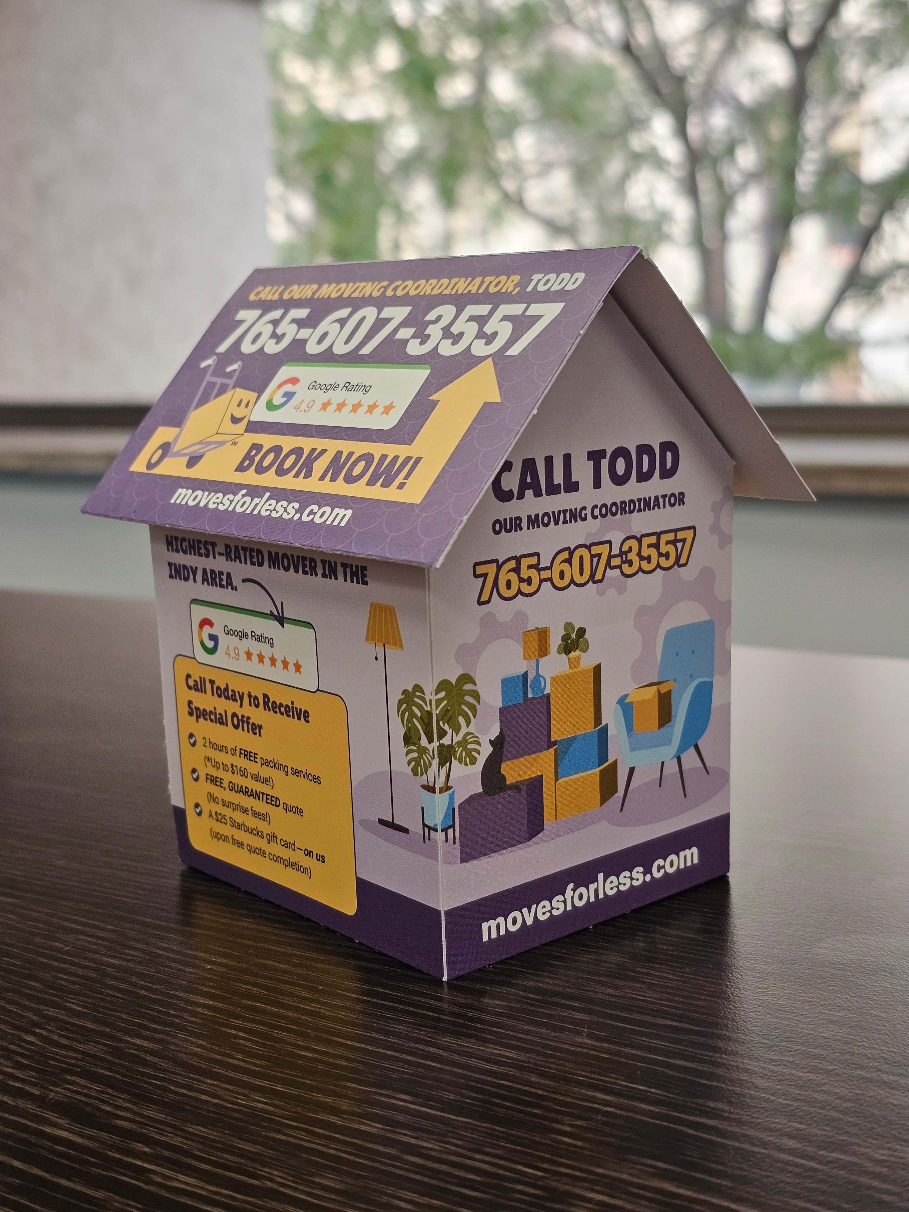
Every side and angle is utilized.
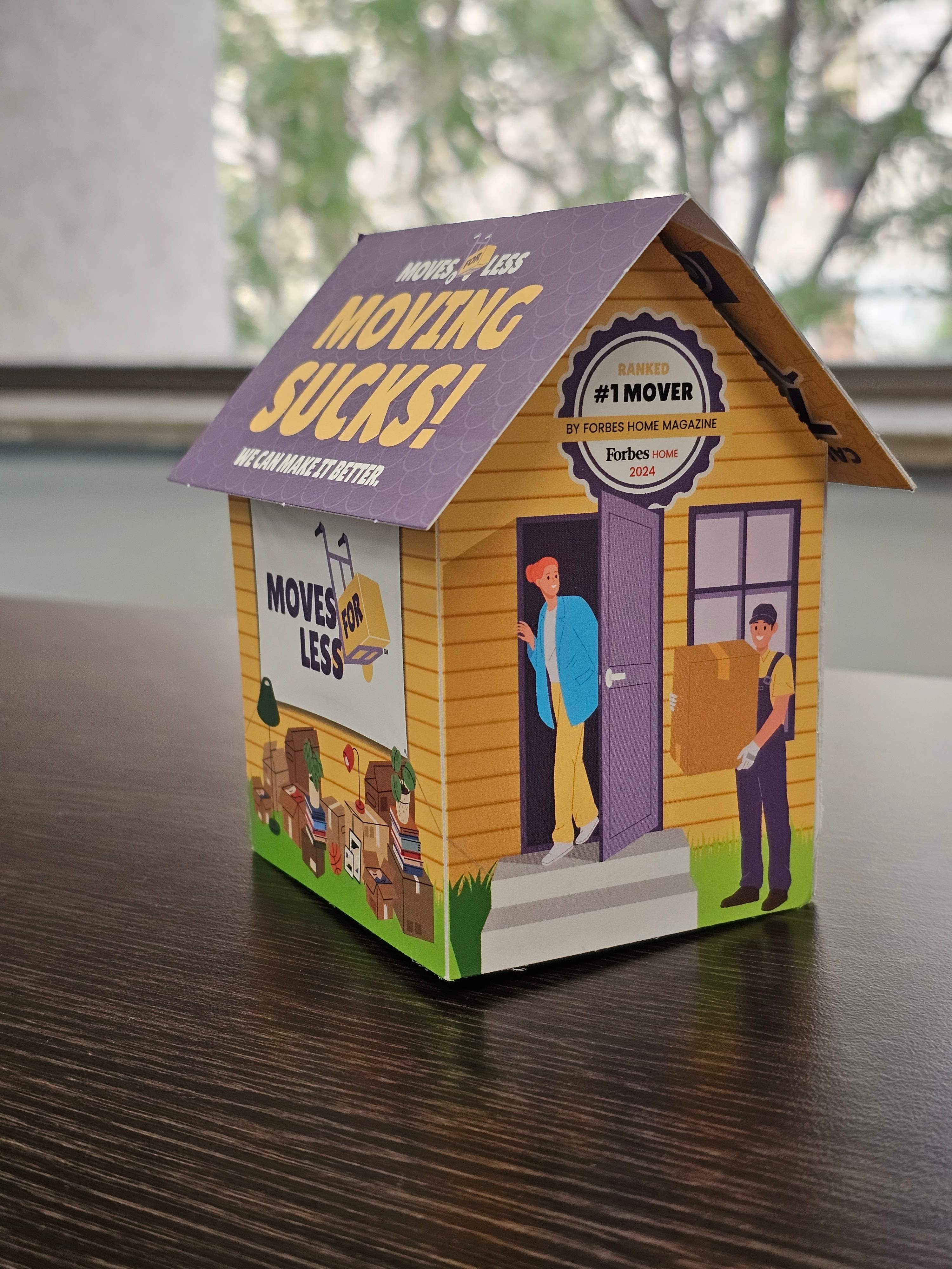
It's memorable and eye-catching.